Pantone Color of the Year: Examining Trends in Fashion through color
Courtesy of The Glossary
Written By: Olivia Belasco
“However, that blue represents millions of dollars of countless jobs, and it’s sort of comical how you think you’ve made a choice that exempts you from the fashion industry…” Though it is entertaining to watch Fashion editor Miranda Preasly educate her dumbfounded and clumsy assistant, there is much more to this iconic scene from The Devil Wears Prada film. Presley explains to her assistant that elements of design like color are not haphazardly chosen in the fashion but carefully curated by the most forceful figures in the industry. Every embellishment, stripe, and fabric choice holds significance from the bargain bin to the runways of Milan Couture Fashion Week. Fashion brands and powerhouse companies constantly sway the trends of the average consumer purchases. As depicted in the movie scene, color is a vessel to display trends and fashion movements. It shows the importance of color in ways far beyond what the everyday shopper understands. There is a slew of ways to investigate trends in fashion, yet color is an easy way to see the trickle-down effect of choices made by top companies and executives. In exploring the importance of color, Pantone is the best example to carefully examine. Pantone is a color institute whose choices have a visible impact on fashion, interior design, art, and other fields.

Courtesy of Pantone
Each year Pantone unveils their “Color of the Year,” a shade or hue that sets the standard for the coming year in art and design. The power of this color far outreaches the fashion industry, sometimes having global impact or even political connotations. Yet, there is no doubt that the color chosen by Pantone has direct correlations to the designs of major fashion houses.

Courtesy of Pantone
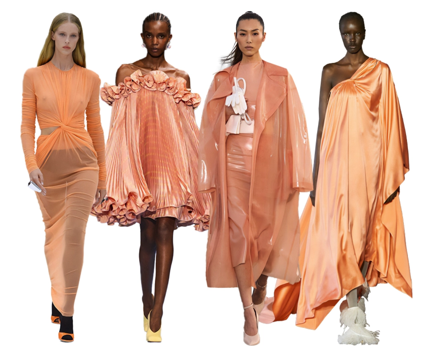
The 2024 Pantone color of the year is named “Peach Fuzz,” described by Pantone as “a hue that echoes our innate yearning for closeness and connection … A shade that resonates with compassion, offers a tactile embrace, and effortlessly bridges the youthful with the timeless.” The Pantone team wanted to embrace a sense of touch, warmth, and connection. Alongside other color trends on the runway like pops of pink for spring or Valentino’s signature red, Pantone’s peach fuzz has made its mark in the shows of top designers. The Zimmermann spring/summer 2024 show is a great example of this color on the runways, as Nicky Zimmermann described the show as “fresh,” “clean,” and “naturalist.” It is very reminiscent of Pantone’s explanations of peach fuzz as a fresh inviting color. With earthy muted tones on organic silhouettes lining most spring/summer 2024 runways, it is no surprise that peach fuzz is included in collections.
Courtesy of Vogue


Other designers to showcase peach fuzz include Jill Sanders, Molly Goodard, and Fendi. They come to life in different textures and combinations, each feeling warm and inviting.
Courtesy of Elle


As The Devil Wears Prada explained it best, the colors that meet high fashion on the runway often trickle down to the bargain bins the average shopper looks in for their everyday clothing. Already we can see peach fuzz marketing itself to the masses. In sportswear by Lululemon and sandals by Birkenstock, peach fuzz has even stuck itself in the millions of pages on fast fashion websites like Shein.

Courtesy of Lily Chérie
Peach Fuzz is a powerful color, “One that reflected our feeling for days that seemed simpler but at the same time has been rephrased to display a more contemporary ambiance. One whose gentle lightness and airy presence lifts us into the future.” At the crossroads of fashion and art, color plays a pivotal role. Pantone’s color of the year is a symbol of the ever-changing trends in fashion and the top companies that sway the choices of designers.